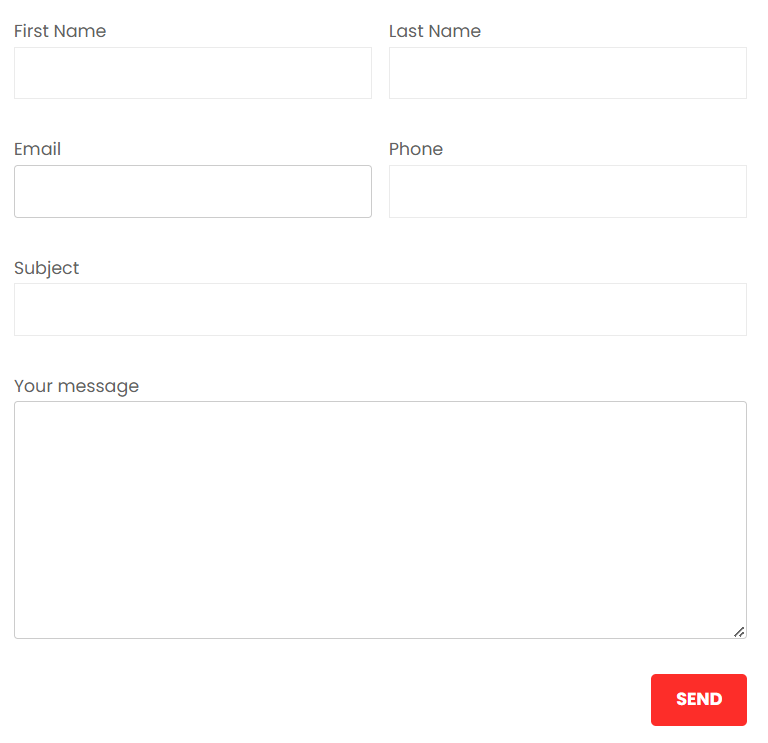
I’ve wrote about creating a two column form in Contact form 7. Now in this tutorial we will see on how to produce a responsive two column form. The form will be in two columns in bigger screens and will come one column in mobile devices. Our final form will look like the following.

you just follow below simple steps:
Step 1: create contact form and copy and paste below code.
and modified field according to your need.
<div id=”responsive-form” class=”clearfix”>
<div class=”form-row”>
<div class=”column-half”>First Name [text* first-name]</div>
<div class=”column-half”>Last Name [text* last-name]</div>
</div>
<div class=”form-row”>
<div class=”column-half”>Email [email* your-email]</div>
<div class=”column-half”>Phone [text* your-phone]</div>
</div>
<div class=”form-row”>
<div class=”column-full”>Subject [text* your-subject]</div>
</div>
<div class=”form-row”>
<div class=”column-full”>Your message [textarea your-message]</div>
</div>
<div class=”form-row”>
<div class=”column-full”>[submit “Send”]</div>
</div>
</div>
Step 2: copy below css and paste in your customiser

